
Friday Photo Tip | Colors
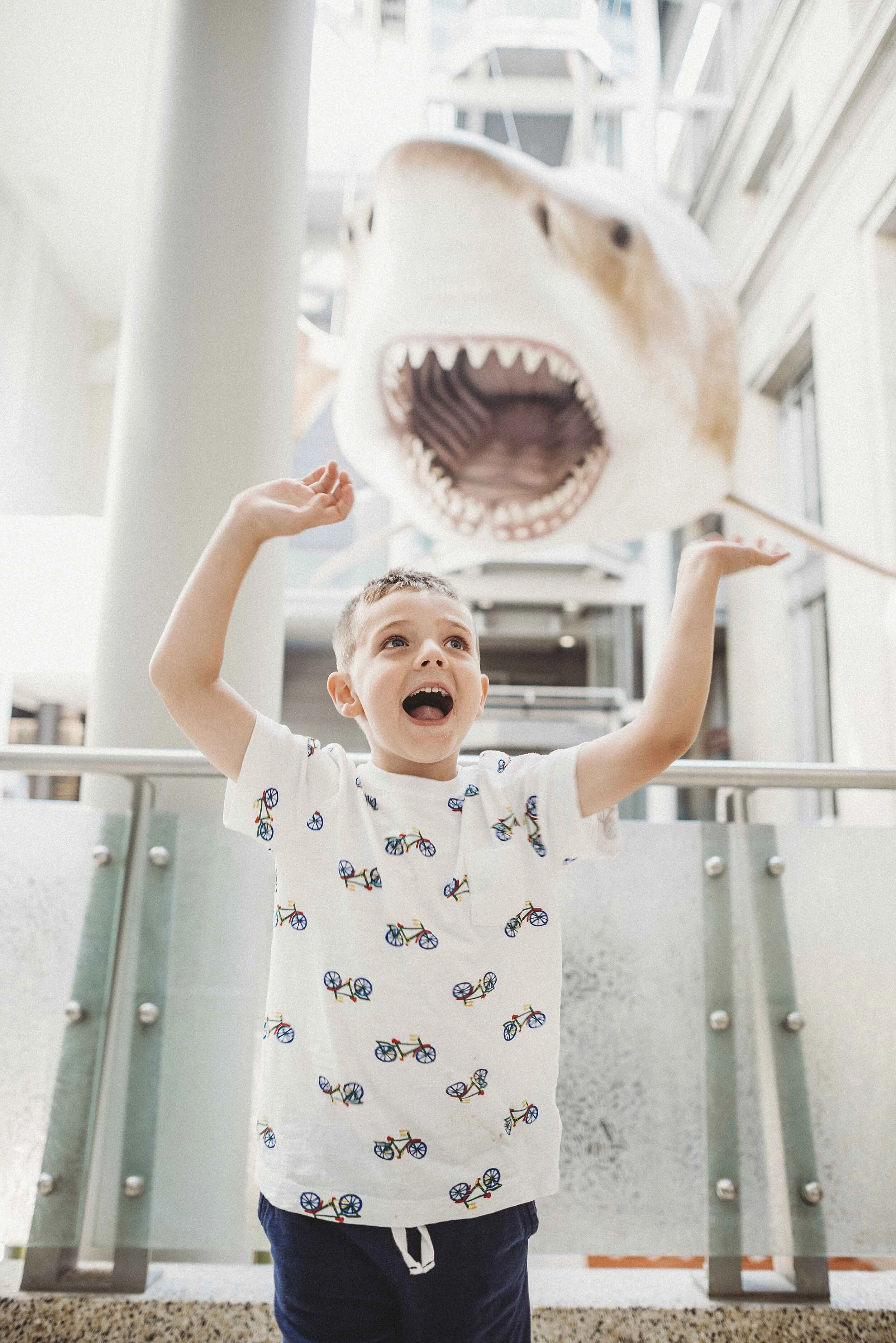
Alright, I’m going to let me freak flag fly a bit here. Color matters to me A. LOT. Like so much so that I will make my kids change clothes to go into the backyard if I know I’m going to be taking photos. I will choose their outfits, sunglasses, and shoes to coordinate with the colors I know will be present in the museum or play space we are visiting. Yeah, my husband thinks I’m nuts. This obsession and (hopefully only slight) annoyance for my kids however, yields some great photographs.
While you certainly don’t need to be as obsessive as me, my tip for the week is this - pay attention to color. Complimentary colors, for example, can really make a photo stand out. In case you don’t remember all those school art classes, complimentary colors are those on the opposite sides of the color wheel. Pairs like orange and blue or red and green. Alternately, sticking to colors in same color family (i.e. warms or cools) can have a pleasing effect too.
Take a look at some of the examples below and start (maybe a little obsessively) coordinating colors!


Would you rather have me worry about the colors? Let’s talk about a session!