Friday Photo Tip | Thirds
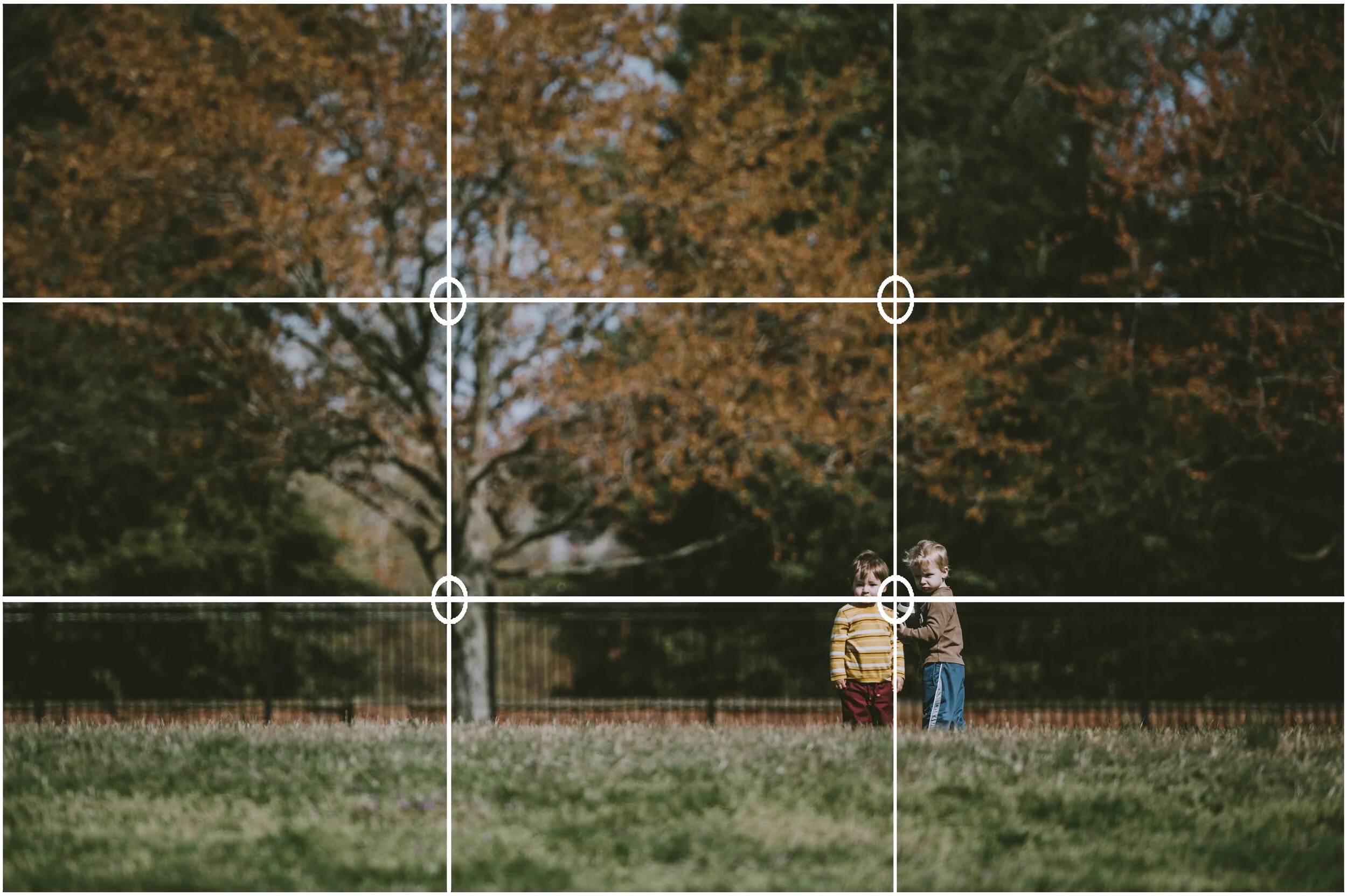
Most folks that dabble in photography even a little are familiar with the rule of thirds — the aesthetic rule that the subject(s) of a photo should be placed on invisible “saddle points” created by dividing your photo into 9 sections (like a tic-tac-toe board). Following this rule creates balanced images that are pleasing to the eye and can even add interest or healthy tension when coupled with negative space.
Now, to take this a step further, my tip for today is about which of these saddle points is best.
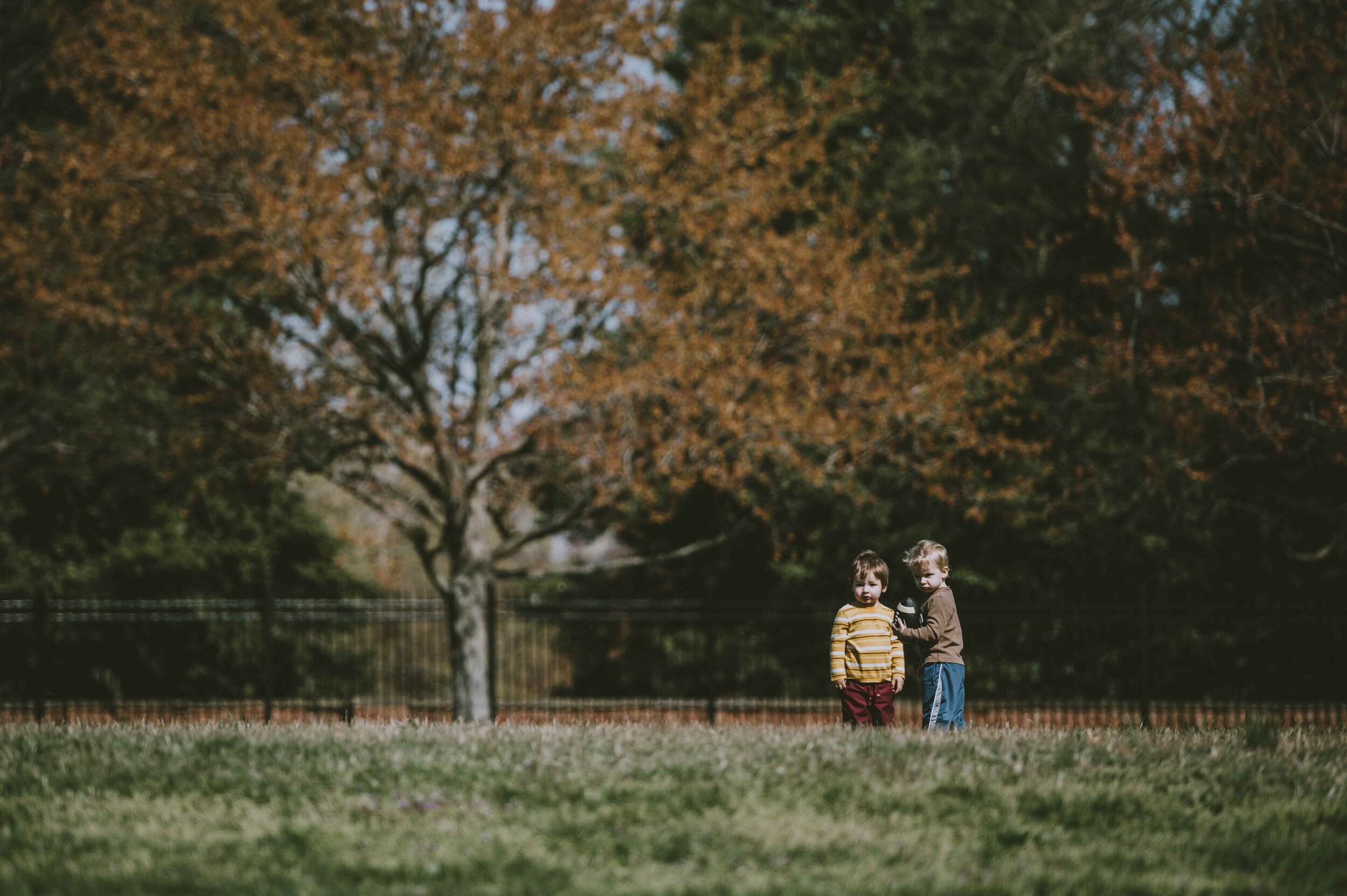
Since we read left to right (at least in most languages) our eyes follow the same pattern when “reading” a photo. To make an image that is most interesting to read, place your subject on the far right saddle points (the points where your tic-tac-toe board intersect). Your eye will read the entire photo landing on the subject last which is ideal.
Now obviously there are absolutely stunning photos that do not follow this rule - but it’s a good starting point and a trusted way to compose a beautiful image!
Want me to do the photo composing? Let’s talk about a session!


